Here’s this weeks #workoutwednesday to design the dashboard shared on workout-wednesday website.
Below is the dashboard design based on criteria’s given on above blog:
Do subscribe to keep receiving regular updates
Thanks!!
Here’s this weeks #workoutwednesday to design the dashboard shared on workout-wednesday website.
Below is the dashboard design based on criteria’s given on above blog:
Do subscribe to keep receiving regular updates
Thanks!!
In today’s blog, I will guide you through how to use sigmoid function and create an Sankey chart using Tableau. Sankey diagrams are specific type of flow diagram in which the width of the arrows is shown proportionally to the flow quantity. Sankey diagram put a visual emphasis on the major transfers or flows within a system.
Below is the illustration of how sankey diagram looks:

This chart has 3 components:
1- Country on left side in stack bar format
2- Flow diagram in center showing the flow
3- Players name on the right side in stack bar
This graph shows depicts the Cricket players and the country where they belong.
Below is the final output of my Sankey chart using Tableau:
Since we have fair idea of Sankey diagram and what it shows lets get going and learn how to make one:
Step 1:
In our example we will consider top 20 ranked ICC cricketers for One day internationals for 2016 and 2017. Import the excel file into Tableau (Below screenshot of data)

Step 2:
Once data is imported we need to define the number of points to draw a smooth sigmoid curve. We will now create a calculated field “Point” and assign 1 for 2016 records and 49 for 2017 records:

Step 3:
For sigmoid curve, the coordinate values should be in between -6 and +6. To generate that curve we will create following calculated fields which we will use to create the curve:
Index = index()
X = 0.25*[Index]-6.25
Sigmoid = 1/(1+EXP(-[X]))

Curve = WINDOW_MIN(IF FIRST()=0 THEN MIN([Rank]) END)+[Sigmoid]*[Change]

Step 4:
Next is to create a bins (padded) based on Point. This will create additional 47 points which we need to create the curve through data densification

Step 5:
Drag Padded into rows and right click –> select show missing values then drag padded to details and then drag index into details as well and make it compute using Padded and similarly drag X into columns and curve into Rows in the sheet then make them compute using padded for both X & Curve as shown in below screen shot:


After bit of formatting, the chart will look like this with sigmoid curve with 2016 vs 2017 rankings of top 20 ODI batsmen:

Our sigmoid curve for Sankey graph is ready. Now, our next step should be to create one worksheet with all the countries and other stack bar with names of the players. Then we can add all sheets in dashboard to get desired Sankey flow chart output.
you can find tableau workbook here
Thanks!!
Do subscribe to blog for getting regular updates 🙂
This blog we will learn to build Candlestick chart for stocks using R. First thing we need to ensure that “plotly” is installed from the GitHub library
install.packages(“plotly”)
install.packages(“quantmod”)
A Candlestick chart is frequently used in stocks, security, derivative or currency analysis to describe the price movement. Each candle indicates single day pattern with its open, high, low and close. Basically they look like box plot but they are not relevant to each other.
plot_ly(x = date, open = …, high = …, low = …, close = …, type = “candlestick”)
library(plotly)
library(quantmod)
Lets take an example of Stock price movement of Infosys where green is increasing and red is decreasing movement in stock price.
getSymbols("INFY",src='yahoo')
## [1] "INFY"
# importing data into data frame and limiting to last 30 days
df <- data.frame(Date=index(INFY),coredata(INFY))
df <- tail(df,30)
Next step is to use plot_ly to plot the graph
p <- df %>%
plot_ly(x = ~Date, type="candlestick",
          open = ~INFY.Open, close = ~INFY.Close,
          high = ~INFY.High, low = ~INFY.Low) %>%
  layout(title="CandleStick Chart")
Create an sharable link for chart
# Create a shareable link to your chart
# Set up API credentials: https://plot.ly/r/getting-started
sharelink = api_create(p,filename="CandleStick")
## Found a grid already named: 'CandleStick Grid'. Since fileopt='overwrite', I'll try to update it
## Found a plot already named: 'CandleStick'. Since fileopt='overwrite', I'll try to update it
sharelink
Please feel free to ask any questions 🙂
Do subscribe to Tabvizexplorer.com to keep receiving regular updates.
#makeovermonday to Visualize World Economic Freedom from 2000-2015 on the basis of dataset shared on <a href=”http://www.makeovermonday.co.uk/data/”>http://www.makeovermonday.co.uk/data/</a> for week 9
Below is the output that I designed for the dataset shared:
Do subscribe for new posts on data visualisation with Tableau
In this post, we will see how to plot candlestick chart in Tableau. We will use the same dataset which we used in previous article on stock analysis – using LOD function.
Here is the final candlestick dashboard for stocks:
Below are the steps to create:
Step 1: Import the stock prices into Tableau which I have in following format.

We will create first 2 calculated fields i.e. closeopendiff and highopendiff formula given below:


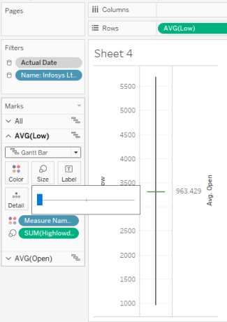
Step 2: Drag Low and Open in the row tab (covert into avg) and make avg(open) into dual axis

Step 3: Edit both the axis and uncheck the include zero checkbox

Step 4: Under tab of Marks, change the automatic to Gann chart for All option. Then under avg(low) in marks tab, drag highlowdiff field into size and make it slim as shown in below image
Step 5: Similarly, drag closeopendiff into avg(open) in marks tab into size and make it thick as shown in below image.

Step 6: Drag actual date from dimension and put into column then right click to change the setting to day as shown below

Step 7: Create one more calculated field to allocate color based on open and close

Step 8: Drag color to avg(open) in marks and put onto color to allocate green for True value and red for False value

Now your candlestick graph is ready to use. you can use date filter to play around with different dates and see the candlestick graphs for different stocks.
Comments and feedback are welcomed!!!
Do subscribe to my blog to keep receiving new posts 🙂