For #MakeoverMonday week 27, this week it was time to work on Rats sightings in New York. It was interesting data about Rats sightings in New York City from 2010 till date with details about it.

Here is the original viz was created by Jowanza Joseph and it seemed to be from R:

Data is available on data.world and source of data was NYC Open Data

Whats good?

  • Simple chart with clear axis which makes it easy to understand
  • Cyclic nature of Rats sighting every year
  • Average line to give an indicator about steady growth in sightings

Here is what I did:

  • Use of Bar chart to represent sightings for each year and its growth from previous year
  • Added month wise and year wise heat map which shows the cyclic nature of sightings each year (around May to Aug)
  • Added Map to show the number of sighting based on zip code
  • Borough filter to see visualisation borough wise.

Here is the Image of the visualisation I created (Click on image to get interactive version):

Thanks for visiting blog. Please do let me know your feedback and if any particular topic you would like me to write on.

Do subscribe to Tabvizexplorer.com to keep receive regular updates.

This week on #WorkoutWednesday was set by Rody Zakovich and it was quite an challenge for me to work on it. This workout was more about working with dashboard actions and data modelling. Basically to evaluate how do we can use Actions to create an single sheet drill down to analyze data from year or month or day to day basis.

Requirements

  • THIS IS A SINGLE SHEET. This is not using the 3 sheets in a container technique
  • The first Level is Year, the Second Month and the Third is Day
    • You drill into whatever you click. If you click on 2015 at the Year Level, you will see all 12 months for 2015
    • Users can control->drag to select multiple years/months and Tableau will drill down with all selected.
  • When a user clicks on a Day at the Third Level, the viz resets back to all Years
  • The Sub Header will let the user know the date range in the viz.

Data for the workout can be downloaded from here

Here is my output for the challenge (Click on Image for interactive version):

Lets go through step by step process of re-creating this dashboard and also understanding how easy it can be to implement this feature into your dashboard and make dashboard interactive without adding any new sheets.

Step 1: Import the superstore data into Tableau then drag orders sheet 3 times into data area and you should be able to see something like this:

For this dashboard requirement we need 3 fields i.e. Table Name, order date and sales so we will remove all other fields and go to Sheet 1

Step 2: Before we start the visualisation, we will create all required calculated fields to ensure we have all the fields ready to use:

DrillLevel: Add identifier for Orders union

Year_Month_date: Calculated field to show data Year and monthly format and will be used for BAR chart for Year and Monthly data

Day_date: Calculated field to show day and will be used for LINE chart to show daily data for the month

BarSize: Size of BAR in the sheet

Drill down filters for current and previous level filters:

CurrentLevelFilter:

PreviousLevelFilter:

Step 3: We are ready to start with visualisation now, lets drag Year_month_date and Day_date into rows and sales into columns

Change both date fields into exact date:

For Year_Month_date, select the chart type as Bar chart and line chart for day_date field then convert day_date into dual axis with sync axis. Remove the color tags from both the axis to main blue shade for charts

Drag PreviousLevelFilter into details section under marks area:

Drag Bar Size into Size area for bar chart (Year_Month_date) and have measure value as minimum:

Step 4: Create a Dashboard and drag sheet 1 into Dashboard

Then go to Dashboard –> Action –> add Filter –> set the filter source field as PreviousLevelfilter and Target field as CurrentLevelFilter as shown below:

That’s it our Drilldown report with single sheet is ready. We will need to format and clean the report to make it look like above final report.

You can download the Tableau file from here

Happy Data Visualisation!!!!

Thanks for visiting this post. Please do let me know your feedback and if any particular topic you would like me to write on.

Do subscribe to Tabvizexplorer.com to keep receive regular updates.

This week on #WorkoutWednesday challenge was set by Luke Stanke and it was about using analytical capability of Tableau specifically clustering. We can perform customer segmentation using clustering algorithm of Tableau but here we will implement clustering algorithm using sub-category and region. In this post, we will go through step by step process of creating clustering and then build Hub & Spoke plots.

Requirements for Workout Wednesday:

  • Dashboard size is 700 x 800; tiled; 2 sheets
  • Create clusters using Profit Ratio (Total Profit/Total Sales) and average discount from only 2015 for sub-category and region. This is the basics of segmentation
  • Show the consistency of each cluster by plotting this over year, as well.
  • Match tooltips.
  • Label the clusters in 2015. Only show the label once. Don’t place many marks of text on top of each other.
  • Match color and formatting. I’ll be paying attention to all parts.
  • JEDI ONLY: Create hub-and-spoke plots that connect the center of each cluster to the value sub-category/region combinations that are part of the 2015 cluster.

Data for the workout can be downloaded from here

Here is my output for the challenge (Click on Image for interactive version):

Step 1: Import the superstore data into Tableau then drag orders sheet multiple times into data area and you should be able to see something like this:

Once data is imported then go to sheet 1

Step 2: As per requirement, we will create clusters using 2015 data on the basis of profit ratio and avg discount. First we will create profit ratio calculated field:

Drag order date from dimensions and filter for the year 2015:

Drag discount field into columns and convert into average then drag profit ratio field into rows. Post this, drag region and sub-category field into details under mark area as shown in below image:

Step 3: From the analytics tab, drag clustering into visualisation area as shown below:

Enter number of clusters as 3

Drag cluster created into data area to create the group and freeze the clusters based on 2015 data and rename the field as 2015Cluster:

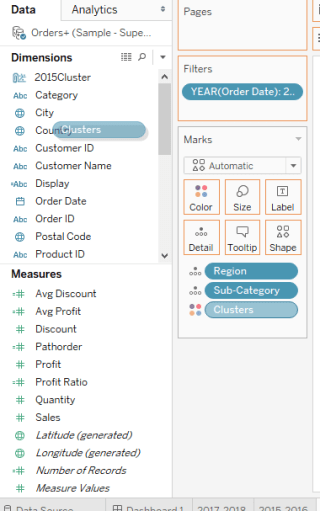
you can click on edit the group field and see that 3 groups are created on the basis of 3 clusters:

Step 4: Next step is to create calculated fields to show average profit and average discount on the basis of sub-category, region and cluster:

Step 5: Add new sheet, drag order date to filters and apply filters for year 2015 and 2016. Drag order date (select year) and avg discount field (convert the measure into average) to columns section

Drag avg profit field twice into rows section (convert the measure into average)

Step 6: Change the chart type for first Avg Profit field to line chart then add Region and  sub-category fields into details along with Table Name field into path as shown in below image

Step 7: Change the chart type for second Avg Profit field to circle chart then add Region and sub-category fields into details and drag Table Name field into size as shown in below image then drag 2015cluster field into colors as shown in below image:

Change the graph into dual axis then the data visualisation layer looks like below:

Perform bit of formatting and adding a reference line will make it look like this:

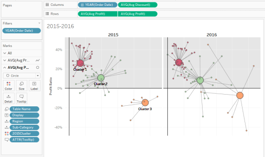
Duplicate the sheet and change filters to 2017 and 2018 then add both the sheet into dashboard. As per requirement change the dashboard size to 700 * 800 and your dashboard is ready with visualisation.

Tableau file can be downloaded from here.

Happy Data Visualisation!!!!

Thanks for visiting this post. Please do let me know your feedback and if any particular topic you would like me to write on.

Do subscribe to Tabvizexplorer.com to keep receive regular updates.

For #MakeoverMonday week 25, Dataset was about influenza cases in the US which was visualized in line chart:

Here is the original viz by CDC:

Data is available on data.world week 25:

Here is what I did:

  • Filtered the data to use from season 2006-07 to 2017-18 (Season 2009-10 had few duplicate weeks in data shared)
  • Used highlight table to show number of patients for each week in season
  • Added tooltip to show number of patients compared to total patients reported

Click on the viz to use the interactive version.

Thanks for visiting blog. Please do let me know your feedback and if any particular topic you would like me to write on.

Do subscribe to Tabvizexplorer.com to keep receive regular updates.

This week’s #workoutwednesday by Ann Jackson was to prepare dataset using Tableau Prep then to design visualisation to show customers spend more on their first or second purchase.

The list of full requirements can be found here but on a high level:

  • Create a dataset using Tableau prep which will return customer level first and second order information with regards to sales, no. of categories and no. of products sold in the order
  • Dataset will have 9 columns i.e. Customer id, 1st Purchase Date, 2nd Purchase Date, 1st Purchase Sum Sales, 2nd Purchase Sum Sales, 1st Purchase # Categories, 2nd Purchase # Categories, 1st Purchase # Products, 2nd Purchase # Products
  • Create scatter plot with First purchase sales vs second purchase sales with 2 strip plots
  • Sheets aligned in dashboard using float method

It was good reason to try out Tableau prep for first time and create the dataset for the challenge. Here is how my workflow looked like in Tableau prep:

developing the viz was pretty straight forward with scatter and strip plot but the tricky part was to arrange all the sheets into float order with pixel perfect output. Took a bit of time to arrange but was able to make it at last. Overall, enjoyed working on Tableau Prep. I will be writing on Tableau prep in coming days to explain how it works.

Here is my output for the challenge (Click on Image for interactive version)

Thanks for visiting blog. Please do let me know your feedback and if any particular topic you would like me to write on.

Do subscribe to Tabvizexplorer.com to keep receive regular updates.